Section 3.1 Stroke, fill, and other graphical attributes
We begin this chapter with a discussion of attributes common to all graphical elements. Many attributes modify properties that are either \(1\)- or \(2\)-dimensional. For instance, a
<graph> will consist of a curve with an attribute @stroke that determines its color. A <polygon> also has a @stroke attribute that determines the color of the boundary of the polygon. It also has a @fill attribute that determines the color used to shade the \(2\)-dimensional region enclosed by the <polygon>.
Subsection 3.1.1 Colors
There are several ways to specify a color, the most simple being to use its name, such as
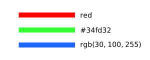
@stroke="blue". Alternatively, one may specify the red, green, and blue components either in hexadecimal, @fill="#rrggbb" or @fill="#rgb", or decimal, @fill="rgb(r,g,b)", where each value is between 0 and 255. Some examples are shown in Figure 3.1.1.
Color should be used judiciously, and the colors used in a single diagram should contrast highly with one another. If you find that you are using a lot of colors, perhaps the idea you are communicating could be better expressed in another way, such as a series of linked diagrams.
Subsection 3.1.2 Stroke attributes
The two most important attributes you will use are
@stroke and @thickness. All the possible stroke attributes are described here roughly in order of importance. You will likely never need the attributes toward the end of this list.
- Stroke
-
The
@strokeattribute determines the color used to draw \(1\)-dimensional components, as demonstrated in Figure 3.1.1. For instance,@stroke="blue"will cause the \(1\)-dimensional component of the element to be rendered in blue. If the attribute has the value@stroke="none", then the \(1\)-dimensional component of the element will not appear.Note that tactile diagrams are rendered with@stroke="black"to guarantee predictable behavior when embossed. - Thickness
-
The attribute
@thicknessdetermines the width of the \(1\)-dimensional component in SVG coordinates. That is, if a graphical element has the attribute@thickiness="1"in a diagram whose dimensions are \(300x300\text{,}\) then the width of the corresponding graphical component will be \(1/300^{th}\) of size of the diagram. Figure 3.1.2 demonstrates different thicknesses.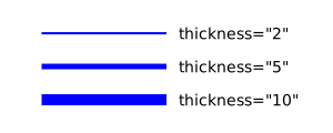
Figure 3.1.2. Stroking with various thicknesses - Dash
-
Use the
@dashattribute to create dashed lines as shown in Figure 3.1.3.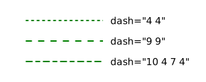
Figure 3.1.3. Dashed lines In a tactile diagram, the@dashattribute is useful for distinguishing different graphical components. Feedback from users indicates that@dash="9 9"is a good choice as the dashes and spaces are \(1/8^{th}\) of an inch. - Opacity
-
Transparency is available using the
@opacityattribute. The value should be between 0.0 and 1.0 with 1.0, the default, being entirely opaque. This attribute applied to both the@strokeand@fillof a graphical component. If the opacity is meant to be applied to only the stroke, use@stroke-opacity.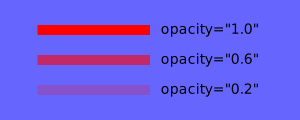
Figure 3.1.4. These lines have @stroke="blue"and varying opacities - Miterlimit
-
On rare occasions, you may find that you need to adjust the
@miterlimitattribute. As seen in Figure 3.1.5, it sometimes happens that a small angle produces a sharp point. The point can be removed by lowering the@miterlimitattribute from its default value of 4.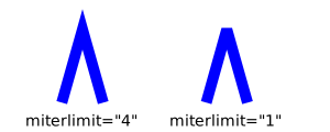
Figure 3.1.5. Lowering the @miterlimitcauses sharp points to be blunted - Linejoin
-
The
@linejoinattribute determines how lines are joined. The default value is@linejoin="miter", whose behavior is controlled with the@miterlimitattribute described above. However, this can be changed as shown in Figure 3.1.6.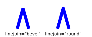
Figure 3.1.6. Various choices for the @linejoinattribute - Linecap
-
The
@linecapattribute determines how lines are capped at their ends. The default value is@linecap="butt"with the other options shown in Figure 3.1.7. The option@linecap="square"causes a square to added to the end of the line, which extends it slightly.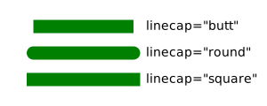
Figure 3.1.7. Options for @linecap
Subsection 3.1.3 Fill attributes
Similarly, there are a few attributes to describe the properties used to fill a region.
- Fill
-
The
@fillspecifies the color used to fill a region, as seen in Figure 3.1.8.
Figure 3.1.8. Squares filled with @fill="red", blue, and green.Tactile diagrams are rendered with@fill="lightgray"to create a consistent texture. - Fill opacity
-
The
@fill-opacityattribute provides a given degree of transparency, as demonstrated in Figure 3.1.9.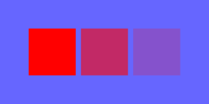
Figure 3.1.9. Squares filled with @fill-opacity="1.0", 0.6, and 0.2. - Fill rule
-
The
@fill-ruleattribute determines how more complicated regions are filled, as demonstrated in Figure 3.1.10.
Figure 3.1.10. Shapes filled with @fill-rule="nonzero", the default, and evenodd.
A region can be filled with a pattern using the
@fill-pattern attribute. This is demonstrated in Figure 3.1.11 and its program listing Listing 3.1.12. Notice that the color of the pattern is determined by the value of the @fill attribute. The possible values of this attribute are-
horizontal -
vertical -
diagonal -
backdiagonal -
dot -
diamond.
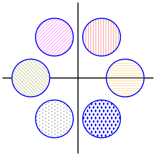
@fill-pattern attribute.By default, a fill pattern does not cover anything that has already been painted as seen by the axis passing behind the rightmost circle in Figure 3.1.11. The leftmost circle, however, demonstrates one way to change this behavior.
<diagram xmlns="https://prefigure.org"
         dimensions="(300, 300)" margins="5">
  <definition>f(k)=2.5*(cos(2*pi*k/6), sin(2*pi*k/6))</definition>
  <coordinates bbox="(-4,-4,4,4)">
    <axes decorations="no"/>
    <circle center="f(0)" radius="1" stroke="blue"
            fill-pattern="horizontal" fill="orange"/>
    <circle center="f(1)" radius="1" stroke="blue"
            fill-pattern="vertical" fill="red"/>
    <circle center="f(2)" radius="1" stroke="blue"
            fill-pattern="diagonal" fill="magenta"/>
    <define-shapes>
      <circle at="c4" center="f(3)" radius="1"/>
    </define-shapes>
    <shape shape="c4" fill="white"/>
    <shape shape="c4" stroke="blue"
            fill-pattern="backdiagonal" fill="rgb(127, 127, 0)"/>
    <circle center="f(4)" radius="1" stroke="blue"
            fill-pattern="dot" fill="#777"/>
    <circle center="f(5)" radius="1" stroke="blue"
            fill-pattern="diamond" fill="blue"/>
  </coordinates>
</diagram>
Subsection 3.1.4 Handles
In Section 1.2, we described how graphical elements can have an identifying handle, given by the value of its
@at attribute, by which they may be referenced from within an annotation. For instance, @at="function-f" provides an identification of this graphical element.
If you look inside an SVG image file created by PreFigure, you will see that the handles are converted into
@id attributes, and it is perfectly fine to use @id="function-f" rather than the @at attribute. The @at attribute is provided to avoid any confusion with @xml:id attributes.
There are restrictions placed on the characters that can be used to form a handle due to restrictions in the characters in an
@id attribute in an EPUB document. More specifically, the only allowed characters are letters, either upper A-Z or lower case a-z, decimal digits 0-9, an underscore _, or a hyphen -.
As we now begin to describe different types of graphical components, we will occasionally need to describe how a component’s handle is processed.